
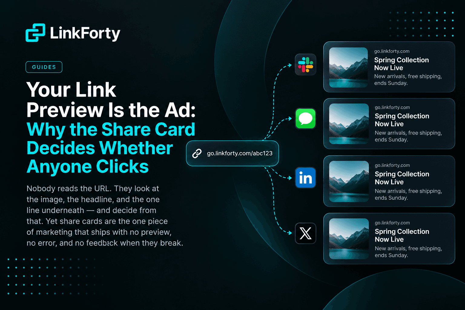
Nobody reads the URL
Think about the last link you clicked in Slack, or on LinkedIn, or in a group chat.
You didn't read the address. You looked at a rectangle — an image, a headline, a line of description — and decided from that, in about a second, whether the thing behind it was worth your attention.
That rectangle is called a share card, and it is generated from a handful of meta tags in your page's HTML. Which means that for every link you have ever shared, the actual advertisement wasn't the copy you wrote in the post. It was the card, assembled automatically from tags you may never have looked at.
Teams that agonize over ad creative routinely ship links whose card is a grey box and a truncated <title>. Not because they decided that was fine — because nothing ever told them.
The feedback loop is broken by design
Most marketing surfaces fail loudly. A broken image on a landing page is visible. A form that doesn't submit generates support tickets. A campaign with no clicks shows up as a flat line in a dashboard.
Share cards fail silently, and in a specific way that defeats normal QA:
- You can't see it yourself. The card the crawler builds is not the page you see in your browser. You're viewing your own site as a human; the card comes from what a bot got when it asked.
- It renders differently per platform. Facebook, X, LinkedIn, Slack, iMessage, Reddit and Bluesky all use different crawlers, and plenty of servers answer them differently — usually unintentionally, via a CDN rule, a bot filter, or preview middleware that lets one user-agent through and challenges another.
- The failure looks like disinterest. A card that renders as a bare URL doesn't error. It just gets fewer clicks, and that shows up in your analytics as a campaign that underperformed. You will blame the copy.
So the one asset that decides whether anyone clicks is also the one asset with no preview step, no error state, and no obvious owner.
What's actually in a card
Four things do most of the work:
Two specifics worth committing to memory:
Images want 1200×630. That's the 1.91:1 ratio every major platform crops toward. Supply something square and the crop will take it somewhere you didn't intend — frequently through the middle of your logo or your text.
Titles get cut around 60 characters. Not exactly, and not identically everywhere, but close enough that a 90-character headline is a headline nobody finishes reading.
The image URL also has to be absolute, publicly reachable, and served over HTTPS without authentication. A relative path works fine when you view the page and fails completely when a crawler fetches it, which is exactly the asymmetry that makes this class of bug survive.
The redirect trap, which matters most if you use short links
This one deserves its own section, because it catches people who are otherwise doing everything right.
If your link redirects, and the destination has its own Open Graph tags, the crawler reads the destination's tags — not yours.
Every tracking link, every short link, every branded redirect sits in front of a destination page. If that page has a generic card, or a competitor's card because you're linking to a partner site, or no card at all, that's what your audience sees. The card you configured never gets a chance.
This is the single most common reason a share card shows "the wrong site entirely." It isn't a bug in your tags. It's that your tags were never the ones being read.
It's also why the fix belongs at the link layer rather than the page layer. A tracking link that serves its own preview to crawlers — while still redirecting humans normally — keeps control of the card regardless of what sits at the other end.
Platforms disagreeing is the failure you can't see
Here's the part most tools get wrong.
The majority of Open Graph checkers fetch your URL once, then re-render that single response inside seven different card frames. Every tab looks identical, because every tab is showing the same fetch. That design cannot detect the most common real-world failure: a server that answers Facebook's crawler and blocks Slack's, or redirects one platform and not another.
To catch it, a checker has to fetch once per platform, using each platform's real user-agent — and then show you the disagreement. That's what we built the Social Share Preview tool to do, and it's free and requires no account.
There's also a hard deadline hiding in this, which is worth knowing before you post:
Facebook and LinkedIn let you force a re-scrape. Bluesky does not. Its CardyB service bakes the card into the post record permanently. A post that captured a broken card keeps it forever — your only remedy is to delete and repost, losing whatever engagement it had. Bluesky is the platform to check before you share, not after.
A short checklist
Before a link goes into a campaign, an email, or a post you care about:
- Look at the card, not the page. They are different artifacts produced by different requests.
- Check it on more than one platform — or use a checker that fetches per platform, so disagreement is visible.
- Follow the redirect chain. If your link redirects, confirm whose tags are actually being read.
- Size the image 1200×630, absolute HTTPS URL, no authentication.
- Keep the title near 60 characters so it doesn't truncate mid-thought.
- Check Bluesky first, because it's the one you can't fix afterward.
The cheap version of all this
Doing the checklist per link doesn't scale past a handful of links, which is the real reason share cards get skipped — not ignorance, just cost per link.
The alternative is to make a correct card the default. LinkForty's Social Share Preview sets an image, title and description once at the organization level, and every short link your team creates inherits it — with per-template overrides when a campaign needs its own artwork. Crawlers get the preview HTML; humans get the normal redirect, at the same speed as before.
Either way, the point stands on its own: the card is the ad. It's worth ten seconds of looking at before you find out from the click-through rate.